Morning all.

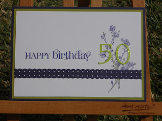
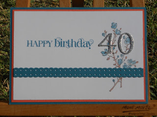
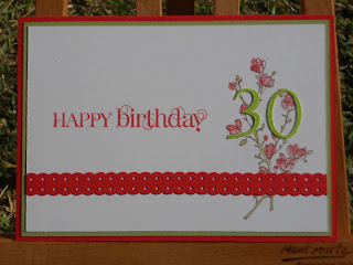
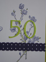
Recently I had a considerable run of “ZERO” birthdays. One was a girl on my netball team and the other 2 were crafting friends….one of whom I know definitely reads my blog from time to time!!

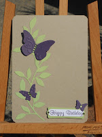
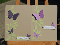
A kind of different source of inspiration for these cards. I found this idea here in Lana Harvey’s blog. Whilst the outside of the card is stunning, it was actually the inside that appealed to me for an idea. With that in mind, I came up with these…….

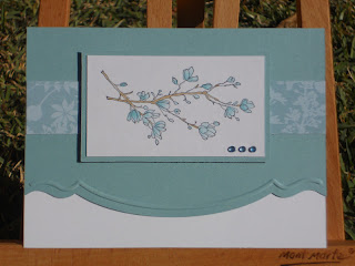
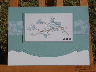
What do you think? They are a little different, and the numbers sparkle. Every gal likes sparkle….don’t they??? I stamped the “bud” image from Simply Soft in a lighter colour than the main and then stamped the “sticks” in the main colour or similar. If I did not have a suitable ink, I stamped off the main colour and then used it.

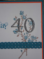
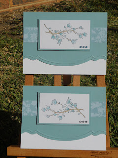
I challenged myself a little with colour combinations, but more than happy with the final results. Here are the 30 and 40 together…….
Thanks for popping by again. I sincerely appreciate your feedback and comments. Even if you have never commented before, please do so.
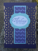
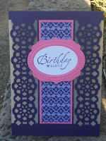
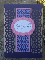
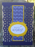
Stuff Used:
CS: (SU) Concord Crush, Lucky Limeade, Poppy Parade, Pear Pizzaz, Island Indigo, Calypso Coral, Whisper White as well as Green and Silver glitter card from Alice in Paperland.
Ink: (SU) Concord Crush, Wisteria Wonder, Lucky Limeade, Poppy Parade, Pear Pizzaz, Soft Suede, Island Indigo, Calypso Coral
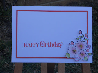
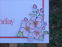
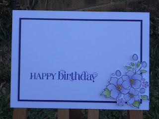
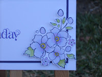
Stamps:(SU) Simply Soft, Curly Cute
Punches: (SU) Scallop Dotted Ribbon Punch
Other Bits: Cuttlebug Olivia Alphabet (for the Numbers)
Lynda xx

Morning all.

Welcome to what is the last of my Craft Camp projects (yippee I hear you all say!!) I have left these till last in the vain hope that I could get a proper picture of them…but alas….bad weather and light became my undoing!!

My inspiration for these cards came from this card by Mickey Roberts. These are my versions……

Initially I had these cards with nothing behind them like Mickey’s, but I then thought it needed something more….so I ended up putting some vellum behind them. This gave it such a wonderful look IRL.

The little labels are done with the new Framelit dies and an embossing folder.

Here are all four lined up together……….

Again, I sincerely apologise for the horrid and dodgy photography. Sydney over the past couple of months has not been kind to crafters who wish to take pics of their creations!!!!
Thanks for enduring my Craft Camp creations for this year. I will resume normal crafting insanity very soon….promise!!
Stuff used:
CS: (SU) Concord Crush, Whisper White, DSP Stack II (In Colours 2011-2012), Vellum (from Alice in Paperland) and Hot Pink, Pink, Bright Blue and Yellow CS fm Connie’s Creative Scrapbooking,
Ink: (SU) Concord Crush
Stamps: (SU) Sincere Salutations
Punches, Dies and Embossing: (SU) Wide Oval Punch, Ribbon Lace Border Punch, Labels Collection – Framelit Dies, Textured Impressions Embossing Folders Set
Other Bits: Dimensionals, Double sided tape
Lynda xx
Morning all.

Today’s craft camp card was inspired by the amazing Jenny Hayward and her card seen here. Jenny’s creation was in Blushing Bride (a pink!!!) and I guess if you’re gunna CASE…you have to do as the crafting Romans do!!!! Not stopping at that one shade however, I changed a couple of colours position of flowers and came up with some wonderful generic cards for my stash.

These based on Jenny’s card
Then with Cottage Wall DSP
…and finally with the GORJUS Graphic 45 DSP I used here…..

These cards also gave me the chance to play with the wonderful Edgelit Dies and co-ordinating set, Bordering on Romance and the Adorning Accents Embossing folders. They give such a different edge and really make a card look classy.
Thanks so much for the inspiration Jenny. I am very happy with the way that these turned out. Why don’t you stop by Jenny’s blog and see the wonderful things she creates?? 
Thanks for popping by.
Stuff used:
CS: (SU) Very Vanilla, Pear Pizzaz, Blushing Bride, Rich Razzleberry, Orchid Opulence (ret) Springtime Vintage DSP, Cottage Wall DSP (ret) and Graphic 45 Baby and Bride Collection Paper – Unchained Melody – #450023
Ink: (SU) Blushing Bride, Pear Pizzaz, Rich Razzleberry, Orchid Opulence
Stamps: (SU) Mixed Bunch, Brodering on Romance
Punches, Dies, Embossing: (SU) Blossom Punch, Adorning Accents Edgelit Dies, Adorning Accents Embossing Folders
Other Bits: Dimensionals, Lg 1/2 pearls fm Reject Shop
Lynda xx

Morning all.

Today I am sharing a card that was inspired by Bonnie Klass here. It gave me the opportunity to try out one of the beautiful scored backgrounds I had seen around blog land. I also got to play with my Simply Scored. Learnt a lot……as you will see.

I pretty much CASE’d Bonnie’s card. Here are the 2 cards I did…..

I was unsure as to the interval I should have left between the lines. For the record, I also did these on the regular Simply Scored, not the Diagonal Plate. I think I prefer the wider lines. Don’t you??
The lines (from memory were scored at 1/2″ apart on the 1st background and 1″ on the second. On the first card, I did have a wee counting mishap, resulting in a “double score”. Solution….count the lines and repeat it late on, so it looked like it was supposed to be done that way!!!

Another (shameful) admission is that this was the first time I had inked up this set!! It looks good done with markers (as I had done here) or in a single colour. The detail is beautiful.

Thanks for dropping by. Guaranteed….PLENTY more to show….and nearly at the end of my craft camp projects….I promise!!
Stuff Used:
CS: (SU) Elegant Eggplant, Whisper White
Ink: (SU) SWM’s in Elegant Eggplant, Lucky Limeade, Perfect Plum, Eggplant ink pad too
Stamps: (SU) Fresh Vintage (SAB ’12), Curly Cute, Warm Words
Other bits: SU Simply Scored, Nestabilities Classic Ovals and Classic Scallop Ovals, Dimensionals
Lynda xx
Morning all.

I can now post this card, as the person it was intended for was married this weekend past. Truth be told, I only recall vague parts of this card going together as (1)…it was done very late on the Saturday night of Craft Camp and (2)…I was more than slightly hypoglycemic when putting it together!!! On the upside….I was mote than happy with the outcome.

I knew that the colour scheme for the wedding was all vintage tones and I wanted the card to reflect this. I was inspired by the layout I saw here. I loved the idea of the hearts and birds. So…with that in mind, this is what I came up with……

There are lots of little things that are in this card that need a hi-lighted mention. The background is stamped with the largest stamp from “Style Beautiful”….a set that I have not pulled out in some time!! The hearts are actually White lace (yes shock horror…..I used LACE) and what is more shocking….I coloured it with a very light sponging in Tim Holtz Frayed Burlap to age it and make it fir the card. I was soooooooooooooo glad that Connie had these to sell at camp!!


As you can also see, on the bird I also carried through the large stamp to ass texture and interest. The DSP that was used for the Lace Border Punch was carried through onto the wings of the birds too.

Notice the different shape of the label? Believe it or not, it is actually the Decorative Label Punch. I got the idea from here at Debbie Henderson’s blog.

I was so very happy with the vintage look of this card. I can only hope the bride and groom were too. I have a couple more weeks to wait and find out!!

Thanks for popping by.

Stuff used:
CS: (SU) Very Vanilla and Making Memories Paper Reverie – Brun Antique Dictionary DSP (#35856)
Ink: (SU) Soft Suede, Crumb Cake (stamped off), Tim Holtz – Frayed Burlap
Stamps: (SU) Style Beautiful, Petite Pairs
Punches: (SU) Lace Ribbon Border Punch, Decorative Label Punch, Word Window Punch, XL Bird Punch
Other Bits: Lace Appliques from Connie’s Creative Scrapbooking, Dimensionals, Sepia Rhinestones from stash

Lynda xx

Morning all.

Today’s cards show the wonderful simplicity that is gained from just using one or 2 colours.

I sort inspiration from this card I saw on SCS. It appealed to me as it could be pretty much used for any occasion – birthday, sympathy, thinking of you and the list goes on. Here are my 2 versions of the card……

The difference is as simple as changing the direction that the stem goes in. One card has clear rhinestones and the other has clear blue rhinestones.

The image was coloured with an aqua pen then the card was sassed up a bit with one of the beautiful Adorning Accents Edgelit Dies that I am really loving.
The 2 cards together…….
Thanks for popping by and I will be back with the 3rd card from craft camp real soon.
Stuff used:
CS: (SU) Baja Breeze, Whisper White, Urban Garden DSP (ret) and Eraldo Watercolour paper
Inks: (SU) Baja Breeze, Soft Suede
Stamps: (SU) Simply Soft
Other Bits: SU Adorning Accents Edgelit Dies and Adorning Accents Embossing Folders, Clear and Blue rhinestones fm stash.
Lynda xx

hey all.

I guess since it was now a month ago I should share with you the projects I made at Craft camp this year. Once again as in previous years it was at the Collaroy Centre.

Sometime back (and yes better late than never……..) a fellow craftie had a beautiful baby boy. I was inspired by this beautiful card. Here are my 2 versions……

The first keeps to Carrie’s combo of Bashful Blue, Espresso and Crumb Cake.

The second I changed it up slightly by switching the Espresso for Black.
The rattle is just basic punch art, but so very cute and the dry embossing just finishes it off.
The pennants are threaded on brown/white bakers twine and silver elastic cord.
Here are the 2 cards side by side.
I love how a small change here and there can change up the feel of a card just enough. Also no white or Vanilla….who’d have thought?????
Thanks for popping by. Rest assured there are many projects from craft camp to share.
Stuff used:
CS: (SU) Bashful Blue, Crumb Cake, Basic Black, Early Espresso
Ink: SU Early Espresso and VersaColour Black.
Stamps: Clear generic alphabet (I cannot recall who it is from!!)
Punches: CM 1 3-8″ & 1 1-2″ Circle Punch, Carla Craft CP1 Circle Punch, SU Pennant Builder Punch, 1/16″ hand held circle punch.
Other Bits: Brown/White Bakers Twine fm the Twinery, Silver Cord fm Stash, Black Ric Rac fm Stash, Blue Ric Rac fm Connie’s Creative Scrapbooking, dimensionals, Cuttlebug Swiss Dots Embossing Folder, Cuttlebug Seeing Spots Big Dots Embossing Folder, Blue Satin Craft Ribbon fm stash.
Lynda xx

Morning all.
Have you ever seen a card to CASE, the BEST one to suit the occasion…only to find that what you thought would be fairly straight forward, turns out to be the TOTAL opposite!!!!! Welcome to the drama that was my MIL’s Mother’s Day card – 2012!!!!
I saw this card on Judy May’s blog and fell in love with it immediately. It was a slow downhill slide from there!! Problem #1 – dimension. I thought that the card was a standard 1/2 A4 sheet…no…turns out it was a square. I worked this out when I started playing with the framelits and working out that no matter which way I did it, the pink embossed piece would not fit correctly. Once that was sorted, there were multiple Mini issues….but my OCD kicked in and I got there in the end. Here is my version of Judy’s card…….
The small details are what I love in this card. The tones are relatively mute, being Pink Pirouette, Crumb Cake and Whisper White. Then there is all the layering – the framelits, the coloured flowers and all the edged and embossed layers. Lastly, The different sized 1/2 pearls are the perfect finish.

Here is a picture of the card and the gift card box together……

Again, I apologise for the bad lighting in the photos. I hope you can get a sense of the beauty of the card.
Thanks for popping by again. Will be back soon with all my craft camp creations (yes that was nearly a month ago now) plus a whole lot more.
Stuff used:
CS: (SU) Pink Pirouette, Crumb Cake, Whisper White, Eraldo Watercolour Paper
Ink: (SU) Pink Pirouette, Crumb Cake
Stamps: (SU) Bordering on Romance, Occasional Greetings (ret)
Dies, Punches & Embossing Folders: (SU) Wide Oval Punch, Labels Collection – Framelits Dies, Textured Impressions Embossing Set, Adorning Accents Framelits Dies, Cuttlebug Swiss Dots and Victoria Embossing Folders
Other Bits: Dimensionals and Generic White Organza Ribbon, white 1/2 Pearls fm local craft store.
Lynda xx
Morning all.
For all of you in Australia, I hope you are enjoying the long weekend. It is cold, wet and miserable in Sydney, so the blanket on the couch is getting a good work out!!!
I thought I had better share with you my Mother’s day project for my MIL….before the occasion slips into the ether. I am blessed to have one of the best MIL’s in the world. She does so much for us, so I wanted something very special to say thanks. I decided to bolster her card supply with a wee set and box. The card that was for HER for Mother’s day will be part 2.
For the cards inside the box, I was inspired by a couple of cards I saw here and here on SCS. I an really having a lot of fun with the Bordering on Romance SU set…as everyone needs to work on their colouring….right??
I decided to do 4 co-ordinated cards in Island Indigo, Poppy Parade, Concord Crush and Calypso Coral. Now I am sorry that the pics for these are a bit dark, but as I said, the weather for a while now in Sydney has been nothing sort of shocking. So here they are…..
Calypso Coral
Concord Crush
Island Indigo
and Poppy Parade
….and the set together…..
 
The box to case them was based on this tutorial that I found on Mary Fish’s blog. The only change I made was in the width and made is 6 1/2″ (from memory) as our cards and envelopes are slightly bigger.
I stamped the outlined water coloured image all over the WW CS before I stamped the sentiment.
Now there are a LOT of elements here and I will endeavour to list them all, but also please feel free to ask any questions you have with regards to the project.
Stay tuned for Part 2 in a couple of day’s time…the card…which is SOOOOOOOOO not my usual style!!!
Thanks for popping by.
Stuff used:
CS: (SU) Box – Pink Pirouette, Crumb Cake, Whisper White
               Cards – Whisper White, Island Indigo, Concord Crush, Poppy Parade, Calypso Coral
               Also Eraldo watercolour paper
Ink: (SU) Box – Pink Pirouette, Regal Rose, Flourish – PIP, Regal Rose, Daffodil Delight, Lucky Limeade and Pear Pizzaz
               Cards – All leaves/Centres Limeade, Pear and Daffodil Delight. Flowers – Pool Party, Island Indigo, Blush Bride, Calypso Coral, Poppy Parade, Concord Crush, Wisteria Wonder.
Stamp Sets: (SU) Bordering on Romance, Wonderful Favourites, Curly Cute
Other Bits: SU Adorning Accents Edgelit Dies, Dimensionals, Simply Scored, Generic white organza ribbon
Lynda xx
Morning all,
Today’s card is a very simple one indeed. It is almost a direct CASE from this card I found on SCS. Here is my version….
They are not exactly the same as you can see. I am so loving the Embosslit Die as it gives you a quick card in a jiffy.
I rounded and fancy edged the corners for a bit of a change.
….and of course the 2 of them side by side…..
Thanks for popping by again. Soooooooooo many more things to show you.
Stuff Used:
CS:(SU) Crumb Cake, Certainly Celery, Elegant Eggplanr, Orchid Opulence (ret)
Ink: (SU) Elegant Eggplant, Orchid Opulence (ret)
Stamps: Amy R – Birthday Sentiments
Punches/Dies: (SU) Beautiful Wings Embosslit Die, Sizzix Little leaf Die, Word Window Punch, Modern Label Punch, Carla Craft CP8 Corner Rounder and Decorative Corner Rounder punches
Other Bits: Dimensionals, Green Rhinstones fm stash
Lynda xx

Always prepare before you make a choice. There is so much info about 99bandar at https://99bandar.id